Home Depot
This project aims to undertake a comprehensive redesign of the Home Depot's logo, branding, and corporate identity, with the goal of creating a fresh and modern visual identity that captures the essence of the brand.
Target Audience
The target audience for the Home Depot brand are homeowners, DIY enthusiasts, construction professionals, and anyone who needs home improvement products and services. The audience also includes people who are interested in gardening and outdoor living, as well as those who need home appliances, tools, and hardware.
Background
Home Depot is a leading home improvement retailer that offers a vast selection of products and services to homeowners, contractors, and DIY enthusiasts. With over 2,000 stores across North America, Home Depot is committed to providing high-quality products and exceptional customer service. Their product offerings range from building materials and hardware to appliances and gardening supplies. With its extensive selection of products and services, Home Depot has become a go-to destination for all home improvement needs.


Design Process
The design process started with research and analysis of the current branding and the competitive landscape. I then brainstormed and develop several logo and branding concepts that align with the company's objectives and values. The Home Depot logo is a representative of the brand’s reliability, straightforwardness, and accessibility in delivering customers’ needs. The orange color from the Home Depot logo represents warmth, and the white color symbolizes simplicity. After finalizing the logo, I later created the guidelines for its implementation across different channels, including digital and print media.
Design Solution
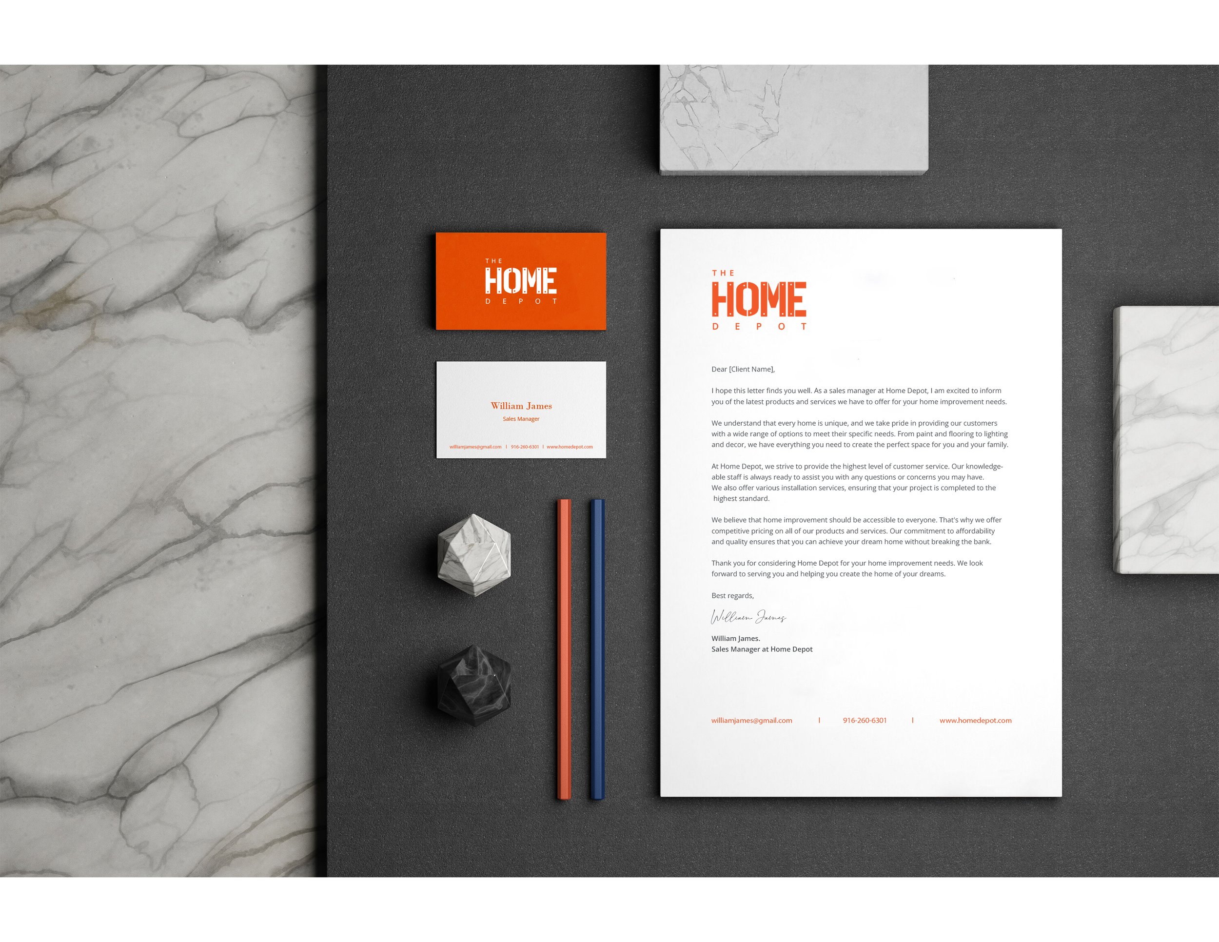
The new Home Depot logo and branding is modern, clean, and memorable. The design features a bold, distinctive font but the same color scheme that reflects the company's commitment to sustainability and innovation. The branding will be consistent across different channels, including in-store signage, digital advertising, and packaging. The new logo and branding will help the Home Depot to stand out in a competitive market and build stronger relationships with its customers.

Design Process
The design process started with research and analysis of the current branding and the competitive landscape. I then brainstormed and develop several logo and branding concepts that align with the company's objectives and values. The Home Depot logo is a representative of the brand’s reliability, straightforwardness, and accessibility in delivering customers’ needs. The orange color from the Home Depot logo represents warmth, and the white color symbolizes simplicity. After finalizing the logo, I later created the guidelines for its implementation across different channels, including digital and print media.
Design Solution
The new Home Depot logo and branding is modern, clean, and memorable. The design features a bold, distinctive font but the same color scheme that reflects the company's commitment to sustainability and innovation. The branding will be consistent across different channels, including in-store signage, digital advertising, and packaging. The new logo and branding will help the Home Depot to stand out in a competitive market and build stronger relationships with its customers.

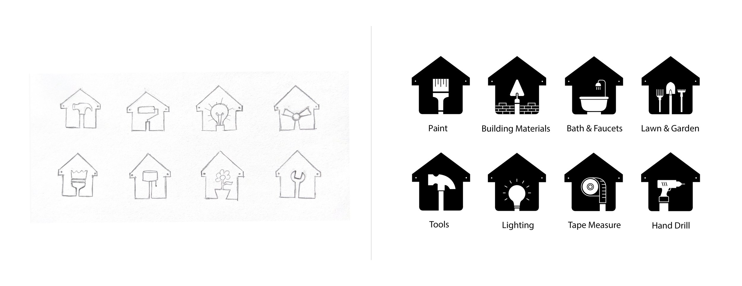
Infographic

Infographic Mockup
